Crystal Color Matching: 4 Rules for a Luxe, Elegant Look
The difference between a bracelet that looks handmade-expensive and one that looks busy usually comes down to color. These four rules keep your design looking intentional and refined.
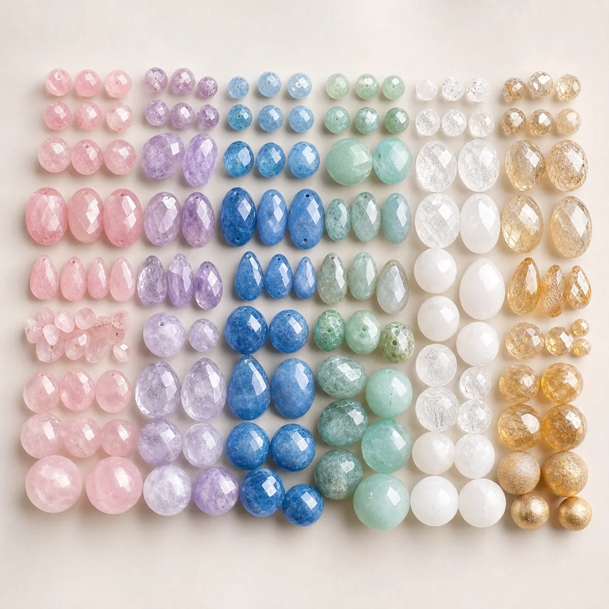
Rule 1: Choose one hero, two supporters
Pick a single dominant color, then two quieter companions. Lavender amethyst as the hero, soft moonstone and clear quartz as support. Restraint reads as luxury.
Rule 2: Stay inside one temperature
Cool with cool, warm with warm. Blue lapis, clear quartz and moonstone live happily together; citrine, garnet and red agate make a warm, grounded story. Mixing temperatures is the fastest way to look cluttered.
Rule 3: Use neutrals as breathing room
White crystal, frosted quartz and silver spacers act like white space on a page — they let your colors stand out instead of competing.
Rule 4: Let metal tie it together
A few silver accents threaded through the design unify everything and add that soft, expensive shimmer. A little goes a long way.
Design your own
Turn inspiration into something you can wear. Build a one-of-a-kind crystal bracelet in our studio.
Start Designing